

A Deep Dive into Product Media
In today’s digital age, software is the cornerstone of business productivity, media creation, and even our daily lives. The success of a product often lies in the balance between usability (UI) and user experience (UX). Whether you’re a designer, developer, or product owner, understanding how to critique a product’s UI/UX is essential in creating software that meets users’ needs while enhancing their interaction experience. In this blog, we’ll explore how to effectively critique the UI/UX of a software product, with a particular focus on media and content creation tools.
1. Understanding UI/UX: A Quick Refresher
Before diving into the critique, it’s important to clarify what UI and UX stand for:
- User Interface (UI) refers to the visual elements of a product — typography, color schemes, buttons, and icons. It’s about how the product looks and feels.
- User Experience (UX) focuses on the overall experience a user has while interacting with the product. It includes functionality, ease of navigation, efficiency, and user satisfaction.
In product media, such as video editing software, graphic design tools, or publishing platforms, the UI and UX are critical because they determine how users interact with complex workflows and creative processes.
2. Evaluating the User Interface: Key Elements
Aesthetic Consistency
Does the software have a coherent and aesthetically pleasing visual identity? A well-executed UI should maintain consistency across various screens and elements. For example, in media creation tools, the layout of toolbars, panels, and icons should be consistent throughout to avoid cognitive overload. A disorganized or inconsistent interface can quickly frustrate users, particularly in professional media environments where time and precision are crucial.
Visual Hierarchy and Readability
Media software often involves multiple layers of content, such as video timelines, graphic layers, or editorial panels. The UI should create a clear visual hierarchy, ensuring that users can easily distinguish between essential controls and secondary features. Text readability is another crucial aspect—tiny fonts or poor contrast can hinder usability, especially when working for long hours on complex projects.
Affordance and Feedback
Do the interactive elements visually suggest their functions? For example, buttons for key actions like “save,” “export,” or “upload” should stand out, not blend into the background. Additionally, providing real-time feedback (e.g., progress bars during rendering) ensures that users understand the system’s state, preventing confusion or mistakes.
Accessibility
Media tools should cater to a wide range of users, including those with disabilities. Evaluating color contrast ratios, keyboard navigation, and compatibility with screen readers are critical steps. A strong UI design prioritizes accessibility to ensure the product can be used effectively by everyone, including those who may have vision or motor impairments.
3. Assessing User Experience: Deep Dive into Functionality
Ease of Onboarding
How quickly can a new user get up and running with the software? Media tools often have steep learning curves, but a well-designed UX can make onboarding smoother. Does the product provide intuitive tutorials, tooltips, or guided workflows for beginners? An effective onboarding experience reduces frustration and accelerates productivity, especially for users new to the tool.
Task Efficiency
Efficiency is critical in media production, where users often perform repetitive tasks like cutting footage, adjusting lighting, or editing text. A good UX focuses on minimizing the number of steps it takes to complete common tasks. For instance, offering keyboard shortcuts or drag-and-drop features can significantly boost productivity for experienced users.
Customization and Control
Does the software provide flexibility and customization options that align with the user’s needs? For example, media tools should allow users to customize their workspace by moving panels or changing color themes to match their personal preferences. The ability to control the interface, rather than being forced into a rigid layout, enhances the overall user experience.
Error Prevention and Recovery
A solid UX prevents users from making mistakes, but it should also allow easy recovery from errors. Features like “undo,” autosave, or warning prompts before irreversible actions (e.g., deleting a project) are essential. In a fast-paced media environment, one wrong click should not lead to losing hours of creative work.
Cross-Platform Consistency
Today’s users expect to work across multiple devices — from desktop to mobile. Does the software maintain UX consistency across platforms? Tools like Adobe Creative Cloud, for example, allow users to transition seamlessly between desktop and mobile apps. A cohesive UX across devices enables users to stay productive wherever they are.
4. Critique in Context: Real-World Media Software
Let’s take a closer look at two well-known media tools (Adobe Premiere Pro and Canva) and critique their UI/UX based on the above principles:
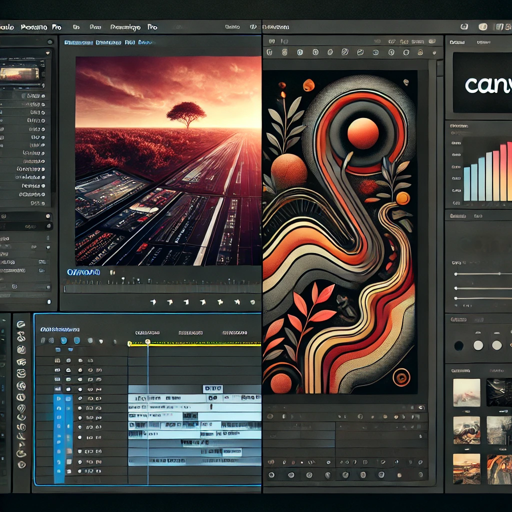
Adobe Premiere Pro: A Professional Powerhouse
Adobe Premiere Pro is one of the industry’s leading video editing tools, designed primarily for professionals working on complex video projects, such as films, TV shows, and high-end content for online platforms. Given its target audience, it offers extensive functionality, but this also means that its interface and user experience can be overwhelming for new users.
User Interface (UI) Critique:
- Customizable but Overwhelming: Adobe Premiere Pro’s UI is highly customizable. Users can rearrange panels, adjust the workspace to suit their workflow, and save custom layouts. For professionals, this flexibility is invaluable, as it allows them to tailor the interface based on their project needs. However, for beginners, the sheer volume of tools, panels, and options can be intimidating. The interface is dense, and a new user might feel lost amidst the countless buttons and icons, especially without prior experience.
- The timeline, media browser, effects control, and source monitor are all crammed into the main window by default, leaving limited breathing space for someone unfamiliar with the tool. A cleaner default layout or a beginner mode could reduce cognitive overload.
- Inconsistent Iconography: While most icons in Premiere Pro are fairly recognizable (play, pause, cut), some are abstract, such as the icons for motion controls and track manipulation. The lack of clear labels and tooltips in some areas means users may need to rely on trial and error to figure out what certain buttons do, which isn’t ideal when working on tight deadlines.
- Dark Mode by Default: Premiere Pro uses a dark color scheme, which is common in professional video editing software to reduce eye strain during long editing sessions. This color scheme works well for seasoned users, but for novices, it can make navigation more difficult. Offering more pronounced contrasts between active/inactive panels or a more vibrant color palette for key tools could make the interface easier to navigate for first-timers.
User Experience (UX) Critique:
- Steep Learning Curve: Premiere Pro is not beginner-friendly, and its UX reflects that. There is an overwhelming number of features that require a significant time investment to master. While there are tooltips and guides, users often have to rely on external tutorials or courses to get the hang of the software. For new users, even simple tasks like importing media or setting up a timeline can feel complex.
- Adobe could enhance its onboarding experience by offering contextual help directly in the UI, with pop-up suggestions based on user actions (e.g., “Would you like help cutting this clip?” or “Here’s how to add transitions between scenes”).
- Task Efficiency and Shortcuts: Premiere Pro excels in efficiency for experienced users, offering a wide range of keyboard shortcuts and customizability. Actions like cutting, moving, and syncing clips are streamlined through hotkeys and drag-and-drop functions, reducing time spent on repetitive tasks. However, learning all these shortcuts is challenging for new users, and Premiere could offer a more interactive way to teach them.
- Adobe could integrate a feature that gradually introduces shortcuts as users perform actions, offering them the chance to learn shortcuts through real-time use, rather than just reading them off a guide.
- Project Complexity Management: One of Premiere Pro’s biggest strengths is its ability to manage complex video projects, allowing editors to handle hundreds of video and audio tracks, transitions, effects, and color grading layers. Its UX for managing these layers is excellent, with clear nesting options, adjustable zoom, and powerful playback controls.
- However, one weakness is the system’s occasional lag when handling large files or complex effects. Providing real-time performance feedback and system optimization suggestions could further improve the UX, especially for users working on resource-heavy projects.
- Cross-Platform Syncing: Premiere Pro’s integration with Adobe’s cloud ecosystem (e.g., Adobe Creative Cloud) enables users to sync their projects across devices. This is particularly useful when switching between Adobe Premiere Rush on mobile and Premiere Pro on desktop, allowing for a fluid UX. The syncing works well, but sometimes network issues cause delays, and the platform could benefit from offering clearer syncing status notifications.
Adobe Premiere Pro is a powerful, feature-rich tool ideal for professionals, but its steep learning curve and dense UI make it less accessible for beginners. It excels in task efficiency for seasoned users and offers extensive customization, though improving onboarding and offering better performance feedback could enhance the overall experience.
Canva: A Tool for the Masses
Canva is a graphic design tool known for its simplicity and accessibility, aimed at non-designers who need to create social media graphics, posters, presentations, and other visual content. Unlike Premiere Pro, Canva targets users with limited design experience, making usability and simplicity paramount.
User Interface (UI) Critique:
- Simplicity at its Core: Canva’s interface is designed to be intuitive and easy to use. The drag-and-drop functionality is central to its design philosophy, allowing users to quickly create visual content without much training. The layout is clean, with well-labeled menus and a minimalistic toolbar that helps users focus on their design rather than being distracted by excessive options.
- The minimal interface works well for basic tasks, but more advanced features, such as creating animations or using design grids, are somewhat hidden in the interface, requiring users to dig deeper. Bringing advanced options more to the forefront for users looking to take their designs to the next level could improve the UI.
- Clear Iconography and Layout: Canva’s icons are clear and recognizable, making it easy for users to know where to click for different actions (e.g., text tools, shapes, backgrounds). The layout is consistent across different templates, providing a cohesive experience whether users are creating a social media post or a presentation.
- One improvement would be making the toolbar customizable. Currently, the set of tools is somewhat rigid, and users have to navigate through multiple steps to access some features. Giving users the option to prioritize frequently used tools in the toolbar would streamline the workflow for repeat users.
- Color and Contrast: Canva’s UI relies heavily on a white background with colored elements for interactive areas (like templates and buttons), which makes navigation simple. However, the contrast between some text and background elements in the side panel is minimal, especially when users are scrolling through different templates or photos. Improving contrast, particularly in the design elements panel, would make it easier for users to view and select content, particularly for those with visual impairments.
User Experience (UX) Critique:
- Easy Onboarding and Templates: Canva excels in UX by offering users hundreds of ready-made templates, making it incredibly easy for a beginner to start creating professional-looking designs. The onboarding process is clear, guiding users with tooltips, video tutorials, and suggestions for templates based on the design type (e.g., Instagram post, presentation, business card). This lowers the barrier to entry, allowing anyone to use the software without prior experience.
- While Canva does a great job for beginners, it lacks more in-depth design training for users looking to advance their skills. Offering intermediate and advanced tutorial paths could help users grow with the platform.
- Task Efficiency and Drag-and-Drop: Canva’s drag-and-drop interface allows users to move elements around with ease. The tool is quick and responsive, making it ideal for quick tasks like creating a graphic for social media. However, more advanced tasks, like aligning elements or adding detailed effects, are somewhat limited compared to professional tools like Adobe Illustrator or Photoshop.
- Canva could improve by adding more grid and snapping options, allowing users to align elements more precisely. This would make the tool more attractive to users who need slightly more control but don’t want to move to a more complex tool like Adobe Illustrator.
- Limited Customization for Professional Users: Canva is great for everyday users but is somewhat limiting for professional designers who need more advanced features. Features like the ability to create complex vector graphics, control over layers, or export designs in various professional formats (e.g., high-res PDF, CMYK for print) are either lacking or only available in the paid version.
- Expanding customization and export options for pro users (and making more of them accessible in the free version) could open Canva up to a broader range of professionals.
- Mobile-Friendly but Limited: Canva’s mobile app mirrors much of the desktop experience, making it easy to create designs on the go. However, more complex designs can become cumbersome on a small screen, as the drag-and-drop functionality doesn’t translate as well. Additionally, some features available on the desktop are not fully implemented on mobile.
- Offering optimized workflows for mobile users, such as simpler editing options or templates specifically designed for mobile screens, could enhance the mobile UX. Improving cross-platform syncing, particularly for collaborative work, would also make mobile use more seamless.
Canva is a user-friendly tool aimed at non-professional designers. Its simplicity and ease of use make it ideal for quick, everyday tasks, though it lacks the advanced features professionals might need. Improving customization, design precision, and mobile usability would allow it to serve a wider audience.
5. Conclusion: Balancing UI and UX for Success
In media and content creation tools, the right balance between UI and UX can make or break a product. While an aesthetically pleasing UI is essential, it should not come at the cost of functionality and user experience. Likewise, a well-thought-out UX ensures users can work efficiently and effectively, but the interface must still be visually clear and accessible.
Critiquing a software product’s UI/UX isn’t just about pointing out flaws but about finding ways to create a more seamless, intuitive, and enjoyable experience for users. Whether it’s improving onboarding, enhancing task efficiency, or streamlining customization options, every element contributes to creating a tool that empowers users to be more creative and productive.
By focusing on both the interface and the experience, product teams can design media software that not only meets the demands of its users but also exceeds their expectations.